


This guide walks through how to evaluate any landscape photograph, prepare the file correctly, and configure the template so the kit you order is worth finishing. By the end, you'll be able to sort good candidates from bad ones in under a minute, and fix most problems before you spend anything.
The core tension: the photos most worth preserving from a country trip, a sweeping valley at golden hour, a meadow with layered hedgerows, a misty tree line, are exactly the kind of images that convert worst. Wide scenes, complex backgrounds, and dramatic light are enemies of the paint-by-number algorithm, which needs clean regions, readable outlines, and clear contrast. Three decisions determine whether the photo makes it to the wall: choosing the right source image, preparing the file correctly before upload, and calibrating the detail level so the template stays enjoyable from the first section to the last.
Step 1: Pick the country photo that will actually survive conversion
Not every landscape photograph is a viable source image. The qualities that make a rural scene photogenic — scale, atmosphere, textural richness — often make it unpaintable.
Paint-by-number templates are produced by simplification algorithms that reduce a photo's continuous tonal gradients into discrete, flat regions separated by outlines. A portrait with a soft background converts cleanly because there are large, distinct shapes: face, clothing, sky. A field photo presents the opposite problem. Hundreds of grass blades, shifting greens, dappled shadow, and mid-distance foliage read as millions of near-identical pixels. The algorithm fragments all of it.
What converts well in rural scenes:
A single, dominant focal element against a simpler background: a red barn against a pale overcast sky; a stone wall cutting through a green field; a lone tree on a hill with clear sky behind it
Photos where one plane of the image is clearly more important than the others, foreground subject, mid-distance interest, simple background, rather than three roughly equal layers of landscape
Even, diffused light (overcast midday or soft morning shade) that preserves tonal separation without creating noise or crushed shadows
What converts badly:
Golden-hour and sunset shots: dramatic light looks beautiful on screen but produces backlighting, silhouetting, and shadow noise that algorithms read as structural complexity. A backlit subject becomes a large, featureless dark shape with nothing paintable inside it.
Wide panoramic views where the subject is essentially the whole scene; conversion requires a hierarchy, the image doesn't contain
Textured surfaces common to rural photography: grassy fields, stone walls, tree canopies, and ploughed earth all look deceptively simple to the eye, but carry enormous pixel-level variation. These are the surfaces most likely to fragment into confetti-sized regions
Low-light and night photos, which carry digital grain the algorithm interprets as detail, scattering clean shapes into dozens of small, meaningless patches
The pre-selection test: Zoom into the most important part of the photo at full screen size. If the features you care about, the barn door, the hedgerow edge, the track leading into the field, are already soft or indistinct, the converted template will be worse. No algorithm recovers detail the camera didn't capture.
⚠️ Gotcha: The most impressive country photo in your library is the highest-risk choice. Visual drama and paintability are frequently in opposition. Choose the image that tells the story clearly over the one that looks most striking at full resolution.
Step 2: Prepare the source file before you upload
Once you have a strong candidate photo, three technical factors determine whether the conversion service can do anything useful with it: resolution, aspect ratio, and lighting quality. All three are fixable before upload.
Resolution: use the original file, not a copy
A photo that looks sharp on a phone screen may carry far less data than its appearance suggests. Social media platforms compress uploaded images, removing nearly 60% of the original file data in the process. That compression is invisible at phone-screen size but becomes obvious when the image is expanded to canvas dimensions. Always use the original file from your camera roll or cloud backup, never a screenshot, a re-download from a social platform, or an image sent via messaging app.
For a standard 40x50cm canvas, the source image should have at least 2,000 pixels on its shortest side, providing roughly 150 pixels per inch at output size. Below that threshold, the template prints blocky rather than detailed. Most modern phone cameras shoot well above this minimum. The problem is almost always that the file has been compressed somewhere along the way.
Aspect ratio: match the photo to the canvas, not the reverse
If a square (1:1) photo is uploaded to a rectangular 4:5 canvas, the image must either be stretched, which distorts proportions visibly, or cropped, which can remove a meaningful slice of the frame. For landscape photos, that lost area is often the horizon, sky, or foreground that anchors the composition. Choose a canvas shape that matches your photo's proportions before ordering, not after. Horizontal country scenes suit landscape-orientation canvases; square crops suit centred, symmetrical subjects like a barn front or single tree.
Basic edits before upload (no advanced tools required):
Crop tighter. The subject should fill more of the frame than it does in the original. Empty sky and featureless mid-ground are wasted canvas area and generate noise in conversion.
Brighten if dark. If the overall image reads as dim, lift the exposure slightly. For backlit or shadowed scenes, raise the shadows slider specifically, not the overall brightness, to recover detail in dark areas.
Skip filters and heavy sharpening. Filters add artificial texture that becomes unwanted noise in the template. Sharpening creates edge halos that translate into messy, doubled outlines in the final template. Use none of either.
⚠️ Gotcha: Screen colors and paint colors are physically different systems. Your phone display produces color with light (RGB); acrylic paint uses pigment. Highly saturated digital colors, the vivid orange of an autumn field at sunset, the electric blue of a clear sky, will always appear somewhat more muted in the finished physical canvas. That's not an error in the kit; it's a property of paint. Photos with naturally moderate saturation convert more predictably.
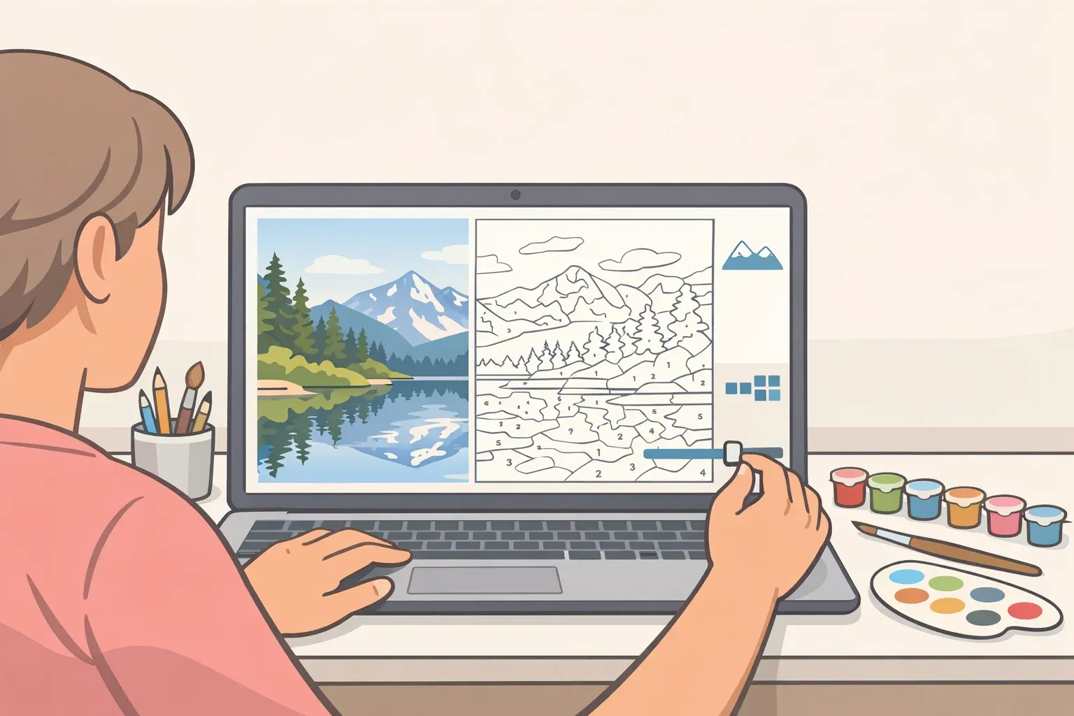
Step 3: Turn your photo into a paint-by-number that's actually usable
With a prepared file uploaded, you'll typically choose how many colors or how much detail the template should include. This is the decision most beginners get wrong in both directions.
Choosing the right detail level for landscape subjects
More colors means more realism, but for country photos specifically, it usually means more tiny regions where a field gradient shifts by a single tone, producing dozens of adjacent sections that are barely distinguishable once painted. The template becomes technically accurate and practically miserable to complete.
The target is a moderate palette: enough tones to convey depth and shading, separating sky from treeline, foreground from mid-ground, light from shadow, without fragmenting textured surfaces into brush-tip-sized patches. For most rural scenes, this means accepting that the finished canvas will be an interpretation of the photo rather than a reproduction of it. That's what makes it art rather than a printout.
Canvas size and detail level are directly linked. A small canvas cannot support a complex template; the numbered sections become too small to fill cleanly, and the numbers too cramped to read. If the design has high complexity, order a larger canvas. If the canvas is small, reduce the color count accordingly.
Reading the preview: the right question to ask
When you check the converted template preview, the natural instinct is to ask whether it looks like the original photo. That's the wrong question. Ask instead: Does it look paintable?
Paintable means three things: the numbers are legible, the sections are large enough for a brush, and the main subject is still recognizable. All three matter more than photographic resemblance.
Diagnosing common preview problems in landscape photos:
Confetti pattern (too many tiny fragments): The background has too much texture, or the detail setting is too high. Crop tighter to push the background further from the subject, blur the background slightly in a basic editing app, then reconvert. This is how illustrators deliberately simplify pastoral scenes. It's not cheating.
Flat, uninteresting result: Add a few tones back incrementally, one step at a time, checking each iteration. Avoid large jumps in detail level.
Black blobs in shadow areas: The original photo has backlighting or crushed shadows. Return to Step 2, lift the shadow detail in editing, and start the conversion again.
Muddy mid-tones where the focal element sits: Too many near-identical shades are clustered together. Increase contrast slightly in the source photo before reconverting; clearer tonal separation in the input produces cleaner region boundaries in the output.
Do a test print before committing to canvas
Before ordering a full custom canvas kit, print the converted template at home on plain paper. A draft print reveals whether outlines are too faint to follow, whether numbers are crowded and hard to read, and whether any regions are too small to fill without frustration. Five minutes and a sheet of A4 paper can save the cost and wait time of ordering a kit that won't work. If the draft print reveals problems, adjust the settings, recheck the preview, and only then submit the final order.
Step 4: Paint and finish the kit so it reads as real wall art
A short, disciplined painting workflow is all that stands between a well-prepared source photo and something worth framing.
Painting efficiently:
Work one color across the entire canvas before switching to the next shade. This minimizes brush cleaning and eliminates the risk of confusing similar neighboring tones mid-session.
Start with medium-sized sections, sky areas, large field blocks, barn walls, and leave the smallest, most intricate regions for last, when brush control has warmed up.
Expect the first coat to look streaky, especially with light or yellow tones over a white ground. Let it dry fully, then apply a second thin coat. Most acrylic kits need two passes for solid, even coverage. Pale sky sections and sun-bleached foreground areas are especially prone to this.
Finishing for the wall:
Touch up any thin patches with a second coat once dry.
If the dividing outlines feel too prominent, this shows up most in large, simple shapes like sky and field blocks; soften them by running a slightly thinned version of the adjacent color along the boundary edge.
Apply a matte or satin varnish. It protects the surface, eliminates the patchy sheen that comes from mixing wet and dry paint areas, and unifies the finish across the canvas.
Frame it and hang it at a normal room viewing distance. Paint-by-number is designed to be read from across a room, not inspected up close. At that distance, subject recognizable, shapes clean, color separation legible, a well-executed kit from a good source photo is a coherent piece of wall art.
⚠️ Expectation note: Paint-by-number builds hand-eye coordination and familiarity with paint consistency, but it won't teach freehand composition or color theory. The goal is simpler: a kit that is worth finishing and worth framing, made from a photo that meant something, with considerably less anxiety than a blank canvas requires.
Pre-order checklist
Use this before submitting any country photo for a custom paint-by-numbers kit:
[ ] Clear, dominant subject; one focal element the eye goes to immediately
[ ] Even, natural light; overcast or soft morning light preferred; no backlighting, flash, or low-light noise
[ ] Original camera file; not a social media download or screenshot
[ ] Minimum ~2,000px on the shortest side for standard canvas sizes
[ ] Aspect ratio matched to the canvas shape you're ordering
[ ] Background cropped or simplified so it doesn't compete with the subject
[ ] No filters, no heavy sharpening applied
[ ] Template preview passes the paintability test: legible numbers, brush-sized regions, recognizable subject
[ ] Test print reviewed and approved before final order
What a good result looks like from across the room: The focal subject is immediately recognizable. Large shapes, sky, field, building mass, are clean and unbroken. Color separation between planes reads clearly. No confetti-like fragmentation in the background. The image holds together rather than reading as a collection of numbered patches.
There is some evidence that structured creative activity carries mental-health benefits, though that research covers creative practice broadly, not custom kits specifically. What's easier to measure is this: a kit built from a photo of a place that matters produces something none of the generic designs can replicate. The photo is the investment. Get the selection and preparation right, and the rest follows.


Comments
Be the first, drop a comment!